How to visualize Home Assistant events data with Azure Data Explorer?

This post is related to the first Home Assistant post published earlier. I recommend you start reading the first part before this. This blog post covers, how to use Azure Data Explorer to visualize the event data provided by the Home Assistant.
Querying the Azure Data Explorer data
A query language that you need to use is called KQL (Kusto Query Language). Practically, a KQL query is a read-only request to process data and return results. KQL is widely used in various Azure products like Azure Data Explorer, Log Analytics, and Microsoft Sentinel.
I don't go through all the details and nuances of KQL in this blog post. I recommend you read more about KQL from the below links.
- Kusto Query Language (KQL) overview
- Learn common operators
- Use aggregation functions
- Join data from multiple tables
- The Basics of Kusto Query Language
- MustLearnKQL blog series
Query limits
This Microsoft documentation explains query limits that you should know.
Kusto is an ad-hoc query engine that hosts large data sets and attempts to satisfy queries by holding all relevant data in-memory. There's an inherent risk that queries will monopolize the service resources without bounds. Kusto provides several built-in protections in the form of default query limits.
Documentation says that KQL limits the number of records returned to the client to 500000, and the overall data size for those records to 64 MB. I'm using the Free cluster and actually, I started to receive warnings when the result set exceeded 50000 records.
Create a Data Explorer Dashboard
A dashboard is a container where you can add Tiles. Tile can be a KQL query that presents data in a table or chart diagram (also maps are supported) or markdown supported text area. If you have used Dashboard in Azure Management Portal you know the drill. In this case, Azure Data Explorer Dashboards will be used to visualize Home Assistant data, especially RuuviTag sensor data (temperature, air humidity, and air pressure).
Azure Data Explorer Portal
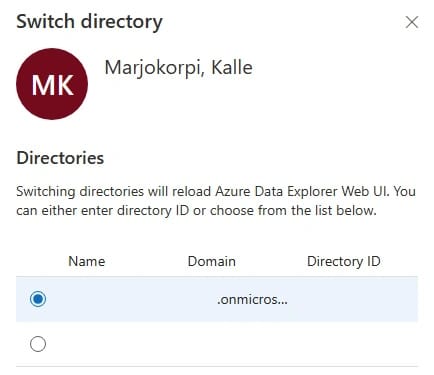
First login to the Azure Data Explorer portal (https://dataexplorer.azure.com/). Before continuing verify that the right Azure AD tenant is selected. You can check that by clicking your profile icon on the right top corner and selecting Switch Directory. For some reason, I typically need to do this tenant switching at least twice until it's properly selected.
Creating the actual Dashboard
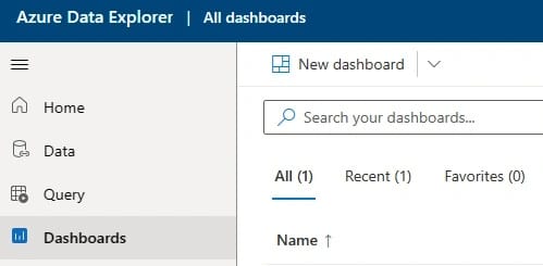
Select Dashboards from the left navigation menu and click New Dashboard.
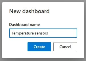
Give a name for the Dashboard.
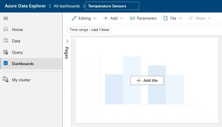
Now Dashboard is ready. Let's add some content.
Dashboard Pages
Dashboards support Pages so you can have a single Dashboard that contains multiple Pages. In this sample, I'll create a separate page for each RuuviTag sensor.
Dashboard Tiles
To add the first Tile to your Dashboard, click Add tile
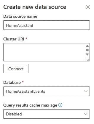
Next, you probably see a message that there are no data sources connected. Click Add new data source. After connecting to your Azure Data Explorer cluster, you can select the database. If you don't remember the Cluster URI, you can check it from the My Cluster view.
Queries
Now we're ready to create the first KQL queries. I'll show a few examples of how I have queried the Home Assistant event data.
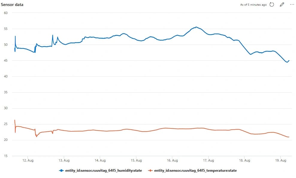
Retrieve humidity and temperature data
This query fetches RuuviTag device's humidity and temperature sensor data and renders data to a line chart. You can either configure visualization in the KQL query or configure visualization via the Azure Data Explorer web user interface. The render operator in KQL supports multiple diagram types from line charts to treemaps etc.
This query uses take operator to return the latest top 50000 rows.
Events
| where (entity_id has "sensor.ruuvitag_64f5_humidity" or
        entity_id has "sensor.ruuvitag_64f5_temperature")
| order by last_changed desc
| take 50000
| render linechart with (xcolumn=last_updated, ycolumns=state, series=entity_id)
The final result looks like this:
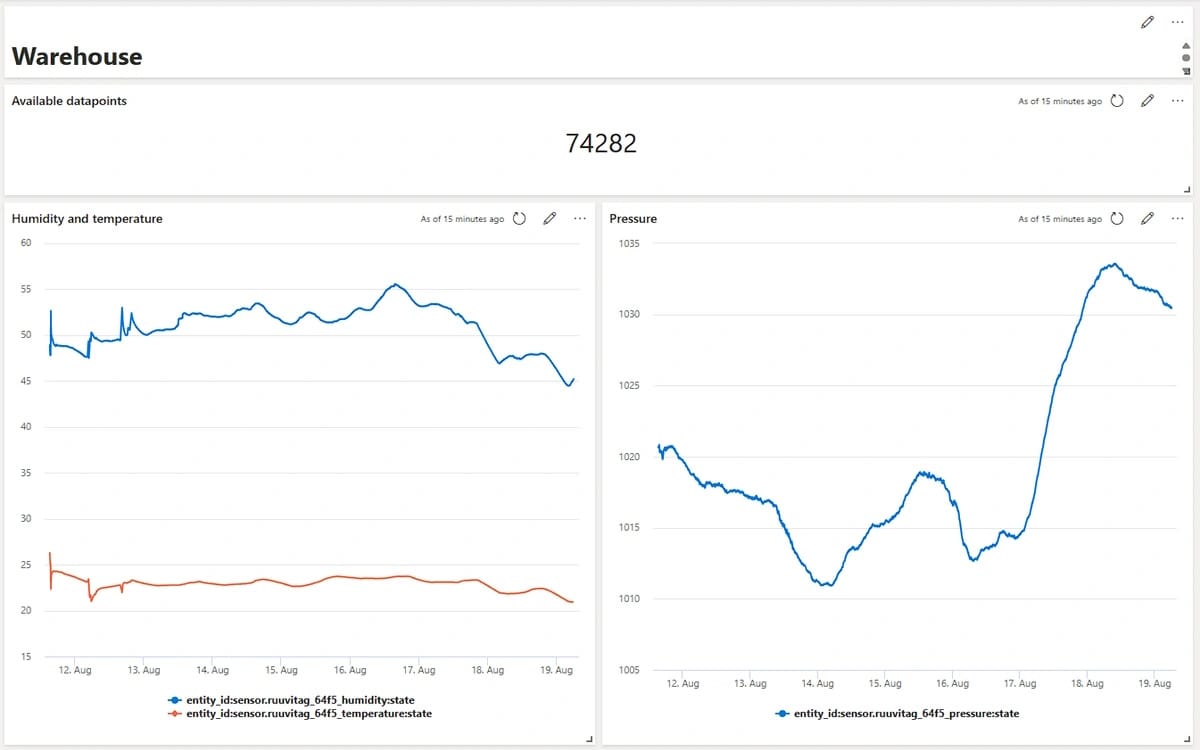
I also added an air pressure diagram Tile and another Tile which shows the total event count of this specific RuuviTag to the Dashboard. The final Dashboard looks like this.
Next, I'll create new Dashboard pages for each RuuviTag sensor.
What else to visualize?
Besides the temperature Dashboard, I'll create a new Dashboard that shows some general statistics from Home Assistant event data.
Show Home Assistant event count per day
The above query uses summarize operator which aggregates the total count of events per day. This is useful to follow the total event amounts per day.
Events
| summarize event_count=count() by format_datetime(last_updated, 'yyyy-MM-dd')
| order by event_count desc
| take 50000
| render linechart with (xcolumn=last_updated, ycolumns=event_count)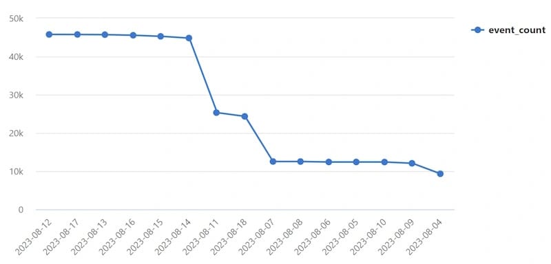
Group events per device type
This query uses union operator to merge two result sets which groups temperature and motion device event counts per day.
let temperature = view () {  Events
| where entity_id contains "sensor.ruuvitag"
| summarize Count=count() by 'temperature', last_updated, format_datetime(last_updated, 'yyyy-MM-dd')
 };
let motion = view () {  Events
| where entity_id contains "motion"
| summarize Count=count() by 'motion', last_updated, format_datetime(last_updated, 'yyyy-MM-dd')
 };
union withsource=tablename temperature, motion
| summarize count() by format_datetime(last_updated, 'yyyy-MM-dd'), tablename
| order by last_updated desc
| take 50000
| render linechart with (xcolumn=last_updated, ycolumns=count_, series=tablename)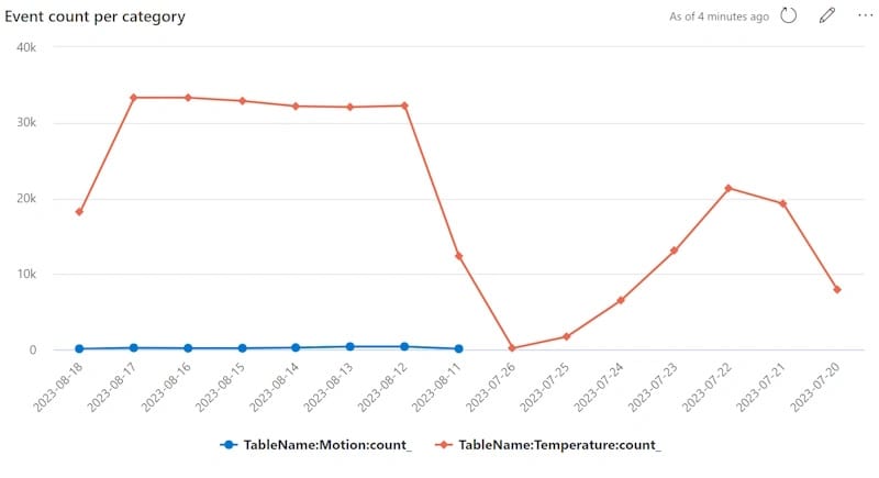
What next?
Home Assistant data ingestion to Azure is super easy and effortless with Event Hub and Azure Data Explorer. I definitely recommend using this kind of service combination if you want to analyze and visualize data easily in Azure. A free cluster of Azure Data Explorer is also spot on because it allows one to ingest a lot of data for free.
Later I'll write more about, how to use Azure Data Explorer SDK to ingest data and how to integrate Anomaly detection into the flow.
Thank you for reading!
Comments